
Personal project · Design and front-end
Portfolio website
- Live
- 2-week redesign and build (09.2026)
- Designer and front-end
- Solo, built with Claude Code
- Web, desktop and mobile

- Background
- I'm building a portfolio website to showcase my product design work and experience to prospective employers and clients.
- Goal
- Help hiring teams quickly understand who I am, how I work and how to reach me.
- Approach
- Build a portfolio website with a lightweight design system and reusable page template, then showcase my case studies through it—refining the experience directly in code with Claude Code.
Goal
Show hiring teams how I design
The site has one job. When I apply for a product design role, the people reviewing my application should quickly understand who I am, how I work and how to reach me.
Design directions
Calm, precise, and quietly confident
Mood and tone
An editorial, minimal site on a black ground, where the work does the talking and the interface stays out of the way. One accent colour, used sparingly, marks where you are and what you can do.
Hero
A portrait lit from behind in a nameless grey space, looking up. Over it, one line in three steps — Simplifying, complex, products — with the middle word in grey. The photo breathes slowly, and a soft glow sits on its brightest spot.
Case study template
Every case study opens with an overview of background, problem, approach and outcome, then moves through numbered sections with a sticky side navigation that marks where you are. Section intros are one or two sentences, and stats show only measured results.

Style guide
Design foundation
Type system
One family, two voices. Geist carries headings and reading text; Geist Mono, drawn as its partner, carries the interface — labels, chips, navigation and captions. Headings sit at 500, tracking tightens as the size grows, and fluid sizes show their mobile to desktop range.
Headings
Simplifying
Recent works
Design foundation
Body
I turn complex problems into simple, meaningful product experiences.
Research & testing
Every case study opens with an overview of background, problem, approach and outcome.
Years designing clinical and complex software
Interface
Non-visit encounter note
Contact →
Colors
Black and white carry the page, alternating panel by panel — black for the hero, work and contact, white for About. A single accent is kept for state: the current page in the navigation and the number in each section label. Every pairing was checked against WCAG contrast.
Ground#000000Dark panels; black type on the About panel — 21:1
Paper#FFFFFFType on dark panels, the About ground — 21:1
Muted#BDBDBDSecondary text, the grey hero word — 11.2:1
Accent#FD2E02Selected state, section numbers — 5.6:1 on black
Corner radius
Pictures round their corners by how large they render: the bigger the picture, the softer its corners. Project cards take the large radius wherever they appear. Controls keep their own shapes — pills for chips and tags, circles for icon buttons.
8pxSmall pictures — the About portrait
12pxMedium, 300–800px — paired shots, option screens
16pxLarge — project cards, case study covers and figures
Project thumbnails
Every project has one picture, prepared twice: a wide 16:10 shot for the case study cover, and a square for the project card on the home page and in the carousel. The squares are recomposed rather than cropped, so no product is cut — the backdrop is extended above and below the device, or, where the product is a phone in hand, the frame moves onto the phone.
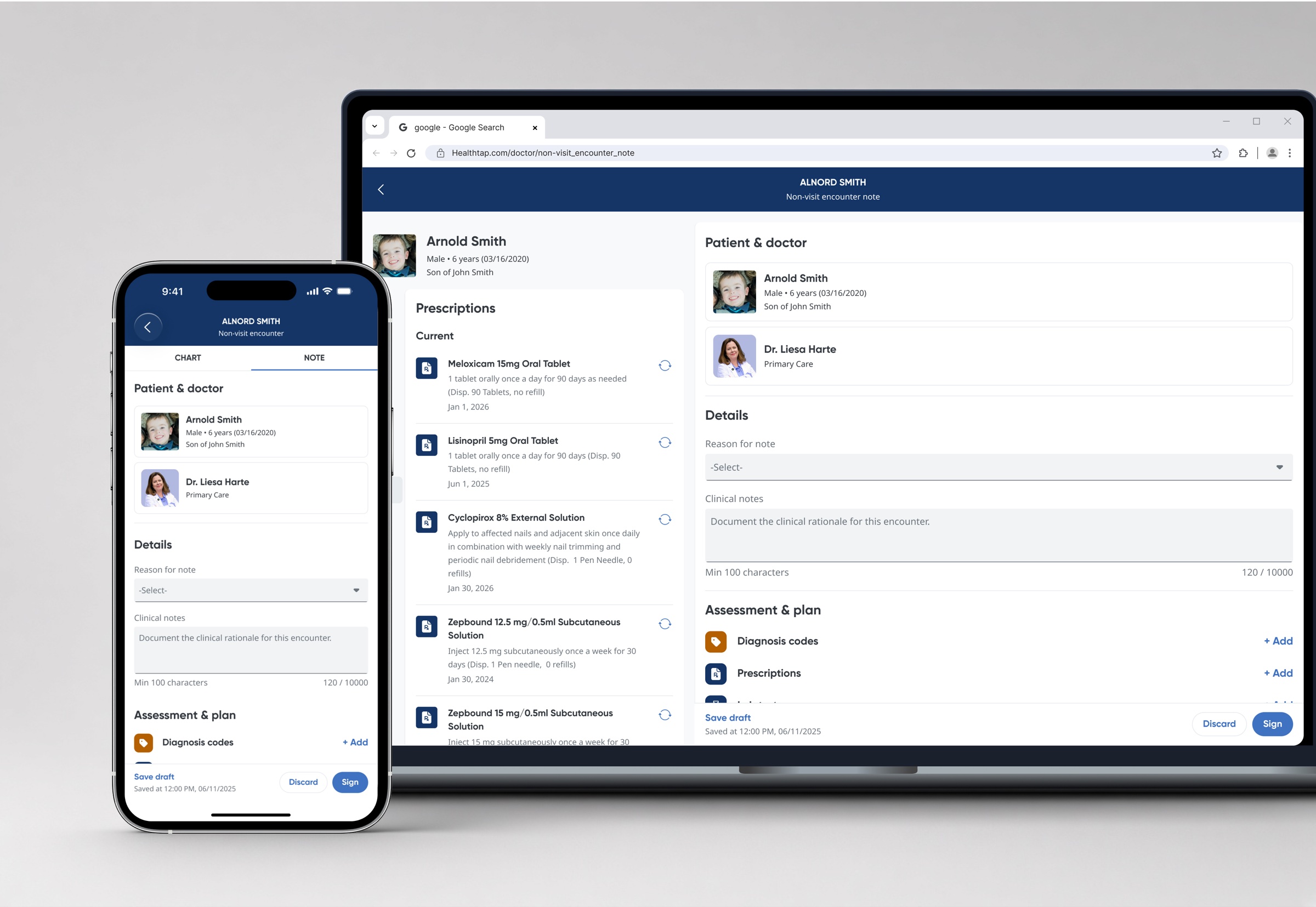
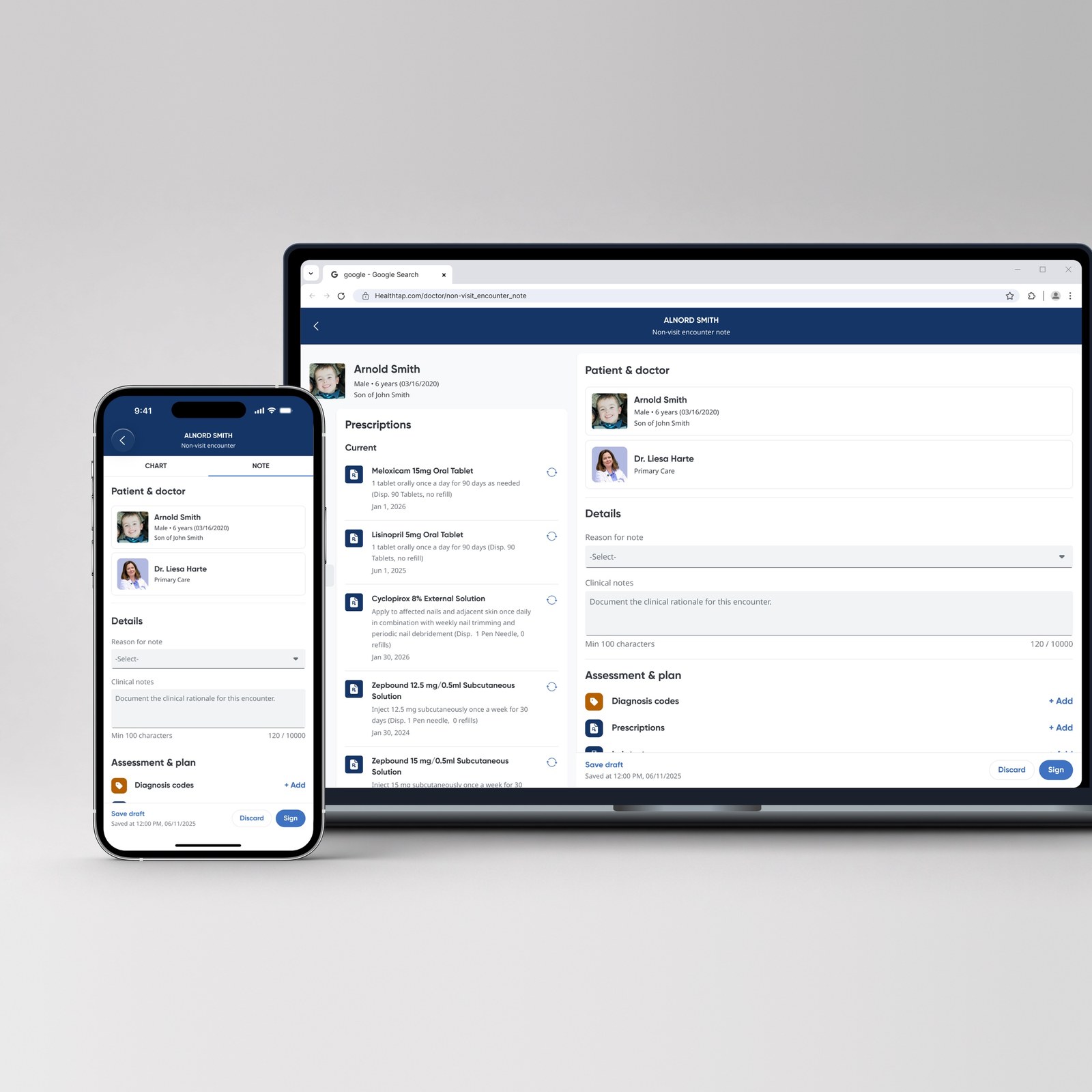
- SizeSquares exported at 1600 × 1600, wide shots at 2400px across, both as progressive JPEG
- ExtendingThe edge of the backdrop is averaged and softened, then blended over a wide band with a touch of grain, so there is no seam where the photo ends
- EdgesAny hairline border left in the source is trimmed first, or it shows as a line inside the square
Divider
One hairline does all the separating: a single pixel at 14%, wherever two things need parting rather than enclosing.
Hairline14% white — between overview rows, panels, contact rows and along the scrolled header
- WeightAlways 1px, never heavier; the colour carries the emphasis instead
- On light14% black on the About panel, the same role inverted
- Label ruleEach section label trails a fixed 48px bar at the same weight
Spacing
Five named measures carry the structure, and everything inside a component steps in fours. The big number is the one that matters: 96px above and below every section is what gives the pages their air.
- NamedSection padding, page gutter and column gap are tokens, so one change moves every page at once
- Fluid pairsLabel to heading is 20–32px and heading to content 40–88px, both scaling with viewport height
- Page widthContent sits in a 1240px frame on a 12-column grid; the header aligns to the same frame
Components
UI Components
Buttons
Actions are set as type — the header Contact is a Label in capitals with an arrow — and controls are round icon buttons: outlined for navigation, filled white for the arrow that opens a project card. The copy control in the Contact email row is a round icon button too.
Text actionAction type, white, arrow trailing. It takes the navigation's bar on hover and a 2px outline on keyboard focus.
Icon button44px circle, 30% white hairline, 10% wash and a 2px lift on hover. The hero scroll cue, back to top, and the carousel arrows — only the arrow direction changes.
Arrow button44px white circle, black arrow. Appears only on a project card, rising in on hover and focus.
Top and side navigations
The top nav and the case study side nav share one indicator bar. Only its intensity changes, so hover, focus and selection read as one pattern. In the top nav the bar sits on the header's bottom edge rather than under the word.
Default62% white, no bar
HoverWhite, 45% bar
FocusHover plus outline
SelectedWhite, accent bar
- HeaderTransparent over the hero; a 72% black band with a background blur and a hairline fades in once the page scrolls
- TypeLabel in the top nav, Body in the side nav
Project card
One component shows a project wherever it appears: in the two columns of Recent works on the home page, and in the carousel that closes every case study. The square picture carries the card; the platforms sit on it as small frosted pills, and the title and the kind of work sit straight on the page underneath.

Telehealth Smart Rails
DefaultPicture, platform tags, title and meta
Non-visit encounter note
Hover and focusPicture zooms, title rolls to View project, arrow rises in
- FrameSquare picture at 16px radius. The card sets no width of its own — the grid or the carousel track around it does
- TagsPlatforms from the case study in Label type, on a 45% black pill with a background blur, top right
- CaptionTitle in Lead at 500, then the kind of work, company and year in Small at 60% white
- HoverPicture zooms to 1.03, the title rolls up to "View project", and a 44px white arrow button rises in beside the caption; keyboard focus adds the 2px outline, and touch screens always show the arrow
Card
A filled panel carrying one supporting point, set in rows of three inside a case study.
Contrast checked
The accent reads at 5.6:1 on black, body type at 21:1.
Visible focus
Every navigation item shows a 2px white outline when reached by keyboard.
- Surface#141414 fill at 10px radius with 28px padding, and a hairline drawn as a 7% white shadow rather than a border
- TypeHeading in Title, body in Body at muted grey
Carousel
Every case study closes with the other projects, so there is always a way forward. The track holds the same project cards as the home page; they scroll horizontally against snap points, and the arrows disappear when the track already fits.
-
Telehealth Smart Rails
-

Virtual primary care
-
Non-visit encounter note
Arrow controls, hidden entirely when the track does not overflow.
- CardThe shared project card, unchanged — square picture, platform tags, caption and hover
- Card widthWhole columns of the content width — three across on desktop, two on tablets, one on phones — so the last card never gets cut
Chips
Chips carry the facts at the top of every case study — status, timeline, role, team and platform — in one scannable row.
- Live
- 2-week redesign and build (09.2026)
- Designer and front-end
- Solo, built with Claude Code
- Web, desktop and mobile
- DefaultLabel type, pill radius, 1px hairline border, 72% white
- StatusWhite fill, black label — reserved for the one shipping state
Performance & access
Sharp on big screens, light on small ones
The hero is one photograph, upscaled once and served as WebP in four widths. The browser fetches only the width it needs — the screen's width on landscape screens, three quarters of its height on portrait ones — so the sharpest file is downloaded only where it shows.
Hero photo file size by width (WebP)
Motion on the compositor
The breathing is a CSS transform on the photo, and the glow canvas pauses whenever the hero is off screen or the tab is hidden.
Contrast checked
Body type reads at 21:1, muted copy at 11.2:1, and the accent at 5.6:1 on black.
Reduced motion
With reduced motion on, the photo holds still, the glow draws a single frame, and the copy appears without its entrance.
More projects